
Sometimes it’s hard to explain a complex idea in words alone. Imagine you’re in a business meeting and one of your team members gives everyone a handout with a wordy breakdown of last year’s sales figures according to various demographics. You get the general idea, but it’s hard to get a grasp on all the data. There are just too many words!
Then your team member tells you to turn the page. Instead of a chunk of text, there’s a graph that provides the same information about the sales figures. Suddenly, all those details are so much clearer and everything now makes sense. Around the conference table, you can see your colleagues—the non-native English speakers as well as the native speakers—looking at each other and nodding. It all makes sense to them, too.
When used appropriately, images, icons, charts, design elements, and other visual aids can turn confusing or complicated text into something that’s easy to understand. In this article, we will explore how to use accessible visual aids in your writing to support better comprehension, communication, and inclusion.
Need Editing and
Proofreading Services?

Why Visual Aids Matter in English Communication
Visual aids aren’t just decorations. A strong image can provide immediate context that words sometimes can’t. Research consistently shows that visual information is processed faster than text. When you combine visuals with words, comprehension improves dramatically, especially if your audience includes English language learners and people with language-related disabilities such as dyslexia or autism spectrum disorders.
Visual Aids in Business and Academic Writing
If you write for international teams or clients, visual aids can reduce misunderstandings and make your communication smoother and more professional.
- In emails: Use bullet points with small icons or emojis to highlight key actions (e.g., ✅ Confirm / 🕐 Schedule / 📎 Attach).
- In presentations: Combine short text with simple infographics or photos that illustrate your message.
- In reports: Include charts or timelines that summarize complex information at a glance.
Supporting Readers with Language-Related Disabilities
How can accessible graphics benefit people with dyslexia, ADHD, autism, and other communication differences? Here are a few examples:
- Dyslexic readers often find images and clear, simple layouts (such as an outline) easier to follow than dense blocks of text.
- Autistic readers tend to be visually oriented, so the images you use can enhance their understanding of a concept.
- People with hearing impairments may rely more on written materials, so combining text with meaningful visuals helps reinforce their understanding.
Making Visual Aids Accessible to Everyone
Accessibility means designing visuals that everyone can understand. Here are some best practices:
- Add alt text to images.
This short description helps screen readers explain visuals to blind or low-vision users. Example: Instead of “image123.jpg,” use “Bar chart showing company sales increasing from January to June.” - Avoid text-heavy images.
If your graphic includes text, keep it simple and make sure it’s readable. Use clear fonts, large sizes, and a high contrast between the background and the words. - Choose colors carefully.
Avoid relying on color alone to convey meaning (for instance, using only red and green to show differences). Use shapes, labels, or patterns to add clarity. - Use simple, universal icons.
Icons can help ESL readers quickly recognize common ideas, such as a phone for “contact” or a calendar for “schedule.” Avoid culturally-specific symbols that might confuse global audiences. - Provide captions and context.
Every image or chart should have a short caption explaining what it shows and how it relates to your text. - Make sure your text is written correctly.
You don’t need to use complete sentences for titles, captions, and other text that accompanies a visual aid. However, be sure to check for typos, spelling errors, awkward phrasing, and other inconsistencies. (Our TextRanch editors can help you with that!)
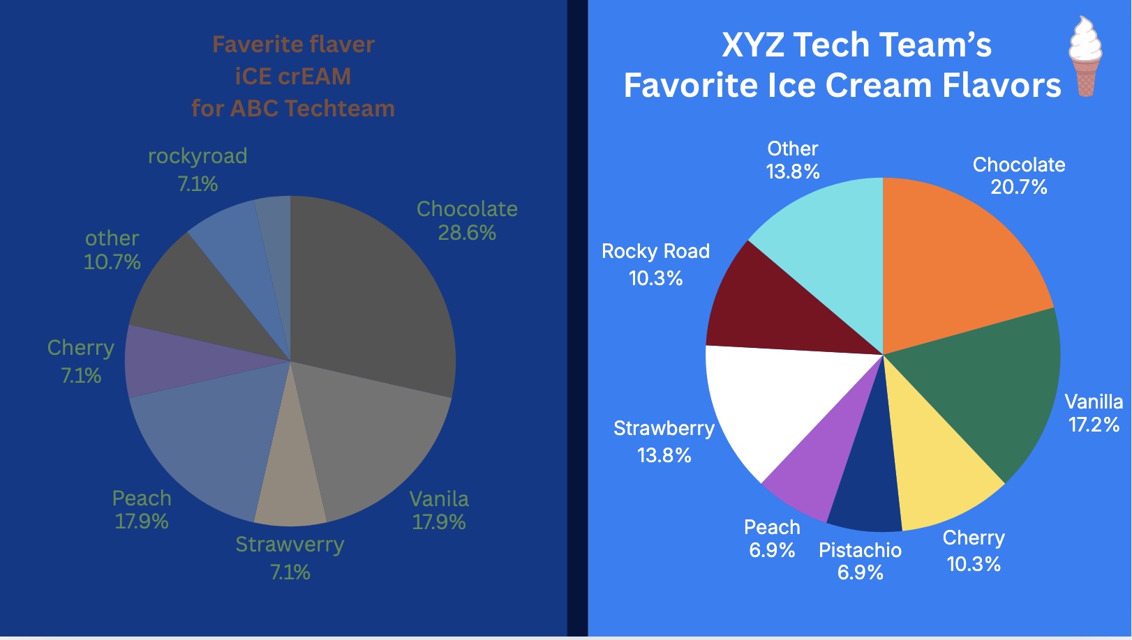
Two Example Pie Charts
Below are two pie charts detailing the ice cream preferences of the employees at two different tech firms. The chart on the left has a lot of issues—spelling errors, typos, and inconsistent formatting. The dark text against the navy blue background is difficult to read. Some of the colors within the pie chart itself are very similar, so it’s hard to make out the different pieces.
Meanwhile, the pie chart on the right is free of typos or spelling mistakes. The contrasting and varied color scheme makes this pie chart easier to read.
Final Tips: Keep It Simple
Visual aids should support your message, not distract from it.
Ask yourself:
- Does this image make my point clearer?
- Can someone understand this visual aid without needing an explanation?
- Is this design readable and accessible to the entire audience?
Need Editing and
Proofreading Services?
If you use our TextRanch document editing service, our editors can look at your visual aids as well as the text within your work reports and academic papers. We will catch any typos or spelling mistakes and we’ll let you know if you’re on the right track!


Ask an Editor: A New TextRanch Feature!
Proofreading vs. Editing: What’s the Difference?
Human Editors: Why Do You Need One?
How can I improve my understanding of native-English speakers? Part 1